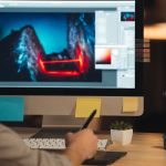
Some might say that history repeats itself but when it comes to website design, I sure hope not. The color scheme of websites has always been a changing trend. On the very, very old Macs nobody was really concerned with what shade of red looked best next to the light gray because, let’s be honest, the Mac screen resolution was awful and we could barely decipher red from blue. But now with smartphones, tablets, laptops, HD TV’s, Blu-Ray players, etc. all of these sharp, crisp colors and images are in our faces every single day. So how does a website stand out from all these other colors scrolling on our Facebook news feeds and stay ahead of the game?
Well, we’ll get to that. But before we talk about the future of color in web design, I think we need to revisit the old, outdated past.
The Past
In the past we’ve seen websites the size of a pocket dictionary. They consisted of about six inches of unused border space with their content contained to the middle of the page and large, unnecessary border of color around it. These borders were usually dark – deep magenta, midnight blue, chalkboard black, or a ripe plum. Of course the rest of the website design followed suit with this color theme. Luckily we moved away from this.
The Present
These days, website design is more about showcasing functionality than a certain color. A lot of websites have one or two main colors that they focus on- blue and orange, blue and white, blue and green, just blue. Yeah you get the picture, it’s A LOT of blue everywhere, company’s love it. But because the color scheme is kept so basic, the functionality is then showcased – videos playing in the background, generic blue icons flying in from the side as you scroll down, blue buttons shaking on the screen as your mouse hovers over it, etc.
The Future
In the future we’re going to see a lot more minimalistic color schemes. Right now everyone wants a website that’s “clean and simple with a lot of white space.” But moving forward I think we’re going to see a different kind of minimalism.
Texture – The future will showcase a minimalistic design that is not a white stark background with icons and videos but yet pale background textures and more prominent graphically unique feature images.
Reverse Colors – Minimalism doesn’t have to mean white space. In the future we’re going to see a lot more colored backgrounds with lighter text and a monochromatic color scheme.
Simple Functionality – We’re currently going a bit overboard on the functionality because it’s so new and cool. But eventually we’ll simplify it and showcase an amazing prominent effect that actually serves a purpose. This could be product images that turn 360 on their own as you enter the page or only one thing that moves on the page to catch your attention.
Less Symmetry – Everything tends to be so balanced and symmetrical but moving forward we’re going to utilize our “white space” and showcase our messaging by placing it on areas of the page that get the visitors’ attention.
Takeaway
Trends are always moving, but the future will hold the classic minimalist theme we’ve always seen, just with a new spin.