In 2016, the user experience of web design moved just as fast as we did and, with advancements in UX simplicity, we’ve reached an opportune moment as we move into 2017. This year truly saw the domination of images over text, desktop push notifications and the continued reign of the grid layout in web design. Yet, for all the high definition product shots and email reminders on our screen, we’ve come out on the other side of 2016 with new hopes for out user interfaces. So, as it usually goes when the user asks for something new, UX designers will be diligently working to implement these web design trends in 2017:
- Originality – With the grid layout type of design that is so popular today, we have gotten to a point where sites and apps are relating to each other with these monotone interfaces. With the Flash taking a backseat and HTML5, CCS3 and JS libraries are growing to handle the impending boom of custom elements meant to create one-of-one product experiences.
- ‘Flat’ Material Design – We are all familiar with the 2-dimensional, non-interactive elements of flat design and, in some instances, prefer its simplicity and minimalism. Yet, since Google’s 2014 release of Material Design, we’ve come to a crossroads of themes: do we employ the versatile language of the new Google system or opt for the more basic, direct approach? For the coming year, designers say: both. UX designers will be looking to advance the best elements of flat design aesthetics with the innovations, like elements moving or appearing transparent, that we’ve come to enjoy from Material Design.
- Page Height Reduction – Creative methods of vertical scrolling is the technique du jour amongst designers today and, for most, this trend doesn’t really show signs of stopping. However, if you place more importance on providing each user with an interaction with more clicks and can hold attention with less reliance on page height, then you may be able to separate yourself from the noise descending scroll bars.
- Typography – Look for typography options to become more varied and larger, as the combination Google fonts and sharper image resolution give UX designers new possibilities to use impactful typefaces.
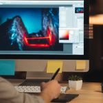
- Illustration – Expanding on the call for originality, the demise of stock images and the rise of original illustration and high-quality photography is the trend to watch in 2017. Relying on the uniqueness of no two hand drawings looking alike, custom illustrations help to add visual appeal and provide a singular experience for the use.
- Animation – In the same illustrations help to differentiate the experience for users, so to do animations work to create a more engrossing experience by using motion to call attention to specific desired elements and creating engaging visual feedback. Some of the WeTransfer uploading pages come to mind for great loading screen-type animations by online brands.
- Micro-Mini Interaction – Customer retention is always a chief concern amongst UX designers and the advance of Micro Mini Interactions only means an invigorated focus on creating an minor, unnoticed experiences in while still engaged in the overall context of the site or app. In a simpler way, think of a micro interaction as something sending out a tweet, while a micro mini interaction is the pressing of the “Send” button. You see, the smaller action in the midst of the overall function of the experience. Look for developers to be ramping up the call for interaction with our apps in 2017.
- Tamagotchi Gesture – This is a peculiar trend, if only because it doesn’t necessarily call for a shift in practice or implementation. Rather, the idea of Tamagotchi Gestures promote embracing the parts of your design that, while not completely streamlined for efficiency, gives a certain charm that users come to identify as a standard characteristic of their experience. As William Gibson wrote in Wired magazine in 1999:“They’re pointless in a peculiarly needful way; they’re comforting precisely because they require tending.” The online community Reddit comes to mind; their user interface is not readily accessible or easily navigated by new users, but forum-like design and bared-down elements make it a hit with all of their current users and the brave souls eager enough to learn the swing of things.
- Hapnotic Feedback – This might be the most far out prediction on this list, but don’t let that mislead you: hapnotic feedback is a real thing and it is very much on its way. Albeit on a smaller scale, engineers are developing technology that uses sound waves or pulse vibrations to create a texture which will make use of haptic clues as a of slightly hypnotize. So, in the near future, there might be a vibration that is associated with your app that subtly suggests, “Buy Now!”
- Optimized Interstitial Anxiety – You know the feeling when you click an action on app, like “Request Uber” or “Send Tweet”, and your device just sits there in limbo? Even if it’s for thirty seconds or a few minutes, being left hanging by an app action is a real stressor and engineers are aware of the issue. Interstitial Anxiety, which refers to the feeling you get when there is a pause between when you complete an action and receive the response, is being answered for with transitional pieces that are meant to help ease the user through the response time of an action.
- User Offboarding – So much focus with website designers is put into innovative ways to improve User Onboarding and retaining customers that the conclusion of the user experience is rarely, if ever, considered. Designers will be option for a more storytelling approach in the coming year, curating special experiences meant to top of a user’s interaction.
- Video – As if you didn’t already know, video is by and large the bread and butter of UX design and implementation. A Cisco study projected that 80% of all global consumer internet traffic will be video trafficin three years. As people get news and information from videos in increasing numbers, look to see more video content being provided by sites and applications.
- Age responsive design – Our user experience has become increasingly more bespoke in recent years; engineers have found new ways to integrate our data into innovations and moments tailored to our preferences. So, it is only natural that we’d adapt to the point of age-responsive design, which will adapt content and structure to the age of the user. Elements like navigation, color and font size will factor in your age to provide you with the best experience.
- Centered/Split Content – Often split between design cues and message dissemination, designers are sometimes forced to make a choice between a content heavy site or a more minimal experience. For those who want to get their point across and still let the design do some talking, split content pages, which divide the screen into wide sections, give designers a new, large space to create and include content with clarity.
- Material Design To Textile Design – We previously mentioned Material Design on this list, and already we seeing innovation and advances with the Google release starting to shift. Textile design, which incorporates an element of design or structure that serves little or no purpose in the new material but was essential to the original material, might be on the rise in 2017. This means things like incorporating elements like bookshelves into book store designs or using a large memo calendar for the inspiration of a calendar app.