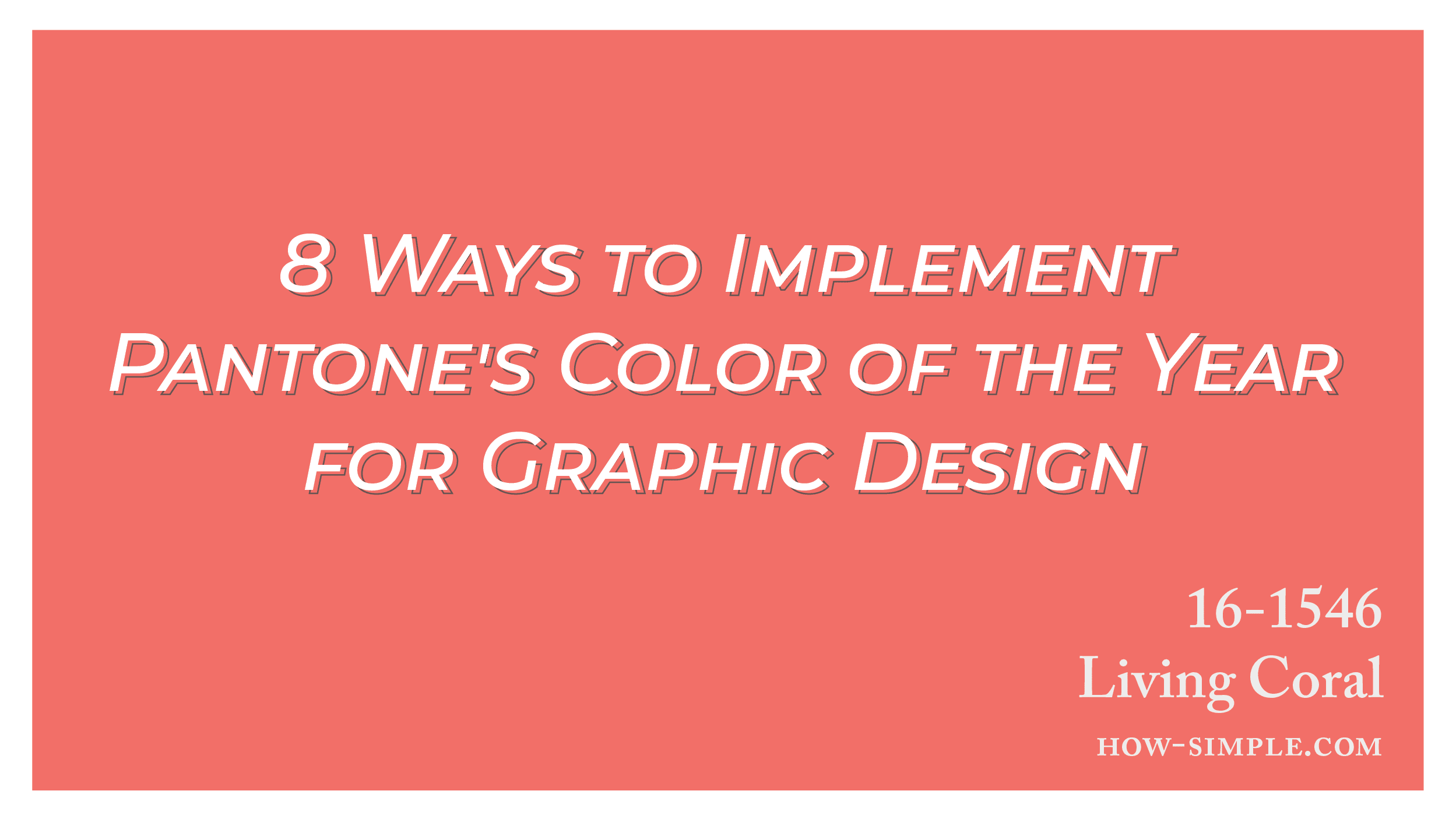
The Pantone Color Institute has named Living Coral its Color of the Year for 2019. It’s pink with a golden or peach tint. The Color Institute helps companies choose the right colors for their products or brands, and its Color of the Year influences several sectors.
You can expect to see Living Coral in home decor, cosmetics, social media, and many other industries. It captures the wonder, magic, and beauty of coral reefs; and it embodies energy, playfulness, and a yearning to connect with nature. It also celebrates peoples’ needs for optimism and authenticity. The color’s official name is PANTONE 16-1546 Living Coral, and it’s ideal for innovative, trendy, attractive graphic design. Here are the best ways you can use Living Coral.
1. Get Inspiration From Nature
Living Coral is a beautiful color for flowers, and you can combine it with images of palm trees on a peaceful beach, succulents, tropical birds, coral reefs, and other parts of nature. Living Coral also looks great as part of a majestic sunset, so Pantone created a graphic design color palette called Shimmering Sunset that contains Living Coral. Other palettes with the shade include Under the Sea and Sympatico, which is based on diverse skin tones and common makeup colors.
2. Use Patterns
You can create a variety of patterns with Living Coral and black, brown, white, or shades of grey. Repeating shapes and optical illusions can give images a sense of serenity and motion. They fit well with Living Coral because it feels vibrant yet calm. You can make a new image or use a filter to give an existing picture or graphic design vector Living Coral accents.
3. Incorporate Textures
Living Coral looks inviting, and it gives people the urge to reach out and touch products and accessories that have it. You can take advantage of this when you use graphic design with a textured look. For example, rough coral, grainy sand, or a fuzzy peach can give viewers the urge to examine your graphic designs more closely.
4. Improve User Responses to Sites and Apps
Living Coral is a bright, warm color that stands out easily, so it’s ideal for representing your company or brand. Use it in your logo, your website, your brand’s app, or other types of graphic design to show people that you’re on the cutting edge of your field. Living Coral makes people feel comfortable, connected, and optimistic. You can use it to counter negative sentiments about social media, digital technology, and the amount of content out there. Making Living Coral part of backgrounds, titles, buttons, and icons will increase response rates and attract more viewers. It can also help you raise sales and visits to a retail store.
5. Be Retro
Living Coral is a trendier alternative to traditional, feminine, romantic colors such as peach and pink. It’s more energetic than pastels. It has a classic appeal, and it works well with the mid-century modern graphic design. Its retro look would fit well in a 1950s home or office. Living Coral is an amazing color for upholstery, accent pillows, curtains, or cabinets. It encourages creativity, and it makes people think about the future as well as the past.
6. Be Romantic
The color’s look and feel are perfect for paper wedding initiations or other event stationery. Match Living Coral with neutral tones of cream, cerulean blue, and white to anchor the graphic design and keep your invitations looking elegant. Living Coral can also make your business cards, your company’s ads, and your signs look memorable.
7. Learn the Psychology of Color
People associate various colors with different emotions. Changing the shades that you match Living Coral to will change the feelings that it evokes. Here are some of the most common connotations of colors:
- Red – strength, power, affection, love, fear, or survival. It can get peoples’ attention quickly, but it can also lead to negative reactions.
- Orange – comfort, satisfaction, fun, warmth, friendliness, enthusiasm, or freedom.
- Yellow – happiness, optimism, confidence, or nervousness.
- Green – harmony, growth, health, logic, science, or peace.
- Blue – trust, reliability, and calmness. Too much can seem cold, or unfriendly.
- Purple – creativity, spirituality, or luxury.
- Pink – love, compassion, or hope.
- Brown – security or protection.
- Black – sophistication, seriousness, mystery, evil, or depression.
- White – purity, innocence, cleanliness or peace.
8. Wear Living Coral
Living Coral’s bold, bright look is perfect for accessories such as shoes, purses, or coats. It makes beautiful earrings or necklaces and striking ties. It can also help company uniforms stand out. A Living Coral logo on a black or grey polo shirt looks sleek and sophisticated, while solid Living Coral makes your employees seem more cheerful and helpful.
Visit Simplemachine for more help creating attractive graphic designs with Living Coral and other trendy colors. We can use marketing to help your brand connect with consumers and become more popular.


