
Though most people might not admit they are swayed by color, the truth is color is profoundly impactful in the context of marketing. People really do react differently to seeing certain hues in specific contexts. Strategically use color, and it will be that much easier to sell your products or services through visually-striking marketing.
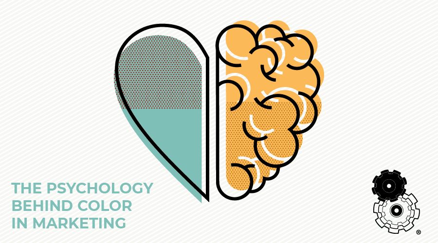
Why Color Matters
In the context of marketing, businesses have about a minute and a half to transmit their message. The prudent use of color ensures the message makes the optimal impact within this small window of time. The right use of color boosts brand recognition by about 80%. Nearly 9 in 10 people are influenced by color when determining whether they will make a purchase.
How do specific colors impact people? There is no clear-cut answer to this question. For the most part, people are affected by color in particular ways. However, there is no guarantee a certain hue will impact one person in the same way as the next individual, and so on. Let’s take a quick look at a few specific examples of colors and how they alter psychology and decision-making in the context of marketing.
Orange
Orange is an underutilized color, yet it’s quite useful in the context of marketing. Orange is symbolic of fun, friendliness, energy, happiness, and motivation. This is precisely why the Nike swoosh logo is often orange-hued.
Yellow
Yellow is symbolic of optimism, happiness, and good fortune. If you’re attempting to boost confidence or inspire others, yellow is the perfect color for your branding material. However, if you use an abundance of yellow, it has the potential to induce anxiousness in audience members.
Purple
Purple is a highly spiritual color. This hue invokes imagination, power, energy, and introspection. Businesses looking to make their value offering seem more intriguing or mysterious will find purple is quite effective when used with other complementary colors. Find just the right balance between the colors you currently use in your marketing materials, and you won’t have to worry about purple distracting your audience.
Red
Red grabs the audience’s eyes, commanding attention. This is a highly dynamic, strong, and passionate color. However, red can also represent fear as well. If you aim to ramp up attention on your product or service, use red in your marketing and branding material. However, if you use too much red, you run the risk of a negative response. So go easy.
Pink
Pink is not as visually striking as red, yet it represents the same passion in addition to care, love, nurturing, and understanding. This is precisely why dating websites and other care-oriented businesses rely on pink for their marketing materials. The only risk in using pink is an excess of the color has the potential to prove forgettable or possibly even overly feminine.
Green
Green is the color of stability and growth. Products and services geared around customers’ health, logic, or rest should feature plenty of green in the marketing materials. Green is a positive color, primarily when its lighter hues are used in marketing materials. Businesses looking to uplift customers’ spirits will find this hue is quite effective at improving mood and getting prospects ready to buy.
Blue
Blue symbolizes dependability and rapport. Customers who view marketing materials with a blue color tend to feel calm, soothed, and trusting. Blue is the perfect hue for businesses seeking to be considered reliable. However, if too much blue is used in marketing materials, it has the potential to come off as cold.
Can Black be Used for Marketing Success?
Black is a sophisticated hue that inspires seriousness. In short, black is a mysterious and potentially depressing color, so use it sparingly. There is undoubtedly a role for black to play in marketing materials on and off the web, yet when misused, it can prove to be quite the downer. Use this hue sparingly to maintain a positive tone with the audience.
The Strategic Use of White
White is often used as a backdrop color. It represents purity and wholeness. If you aim to frame your value offering as something peaceful or utilitarian, white might make the intended impact. Be careful to balance white with other colors or the excess might cause the audience to feel slightly distant from the product/service as well as your brand.
Color and Feeling
Color causes the audience to feel. Use color properly, and you might even tap into the audience’s emotions. Selecting just the right mix of colors for your branding/logo and subsequent signage has the potential to make the difference between your company emerging from the crowded business landscape and blending in with everyone else.
In other words, this is one of your few opportunities to bring your branding to life and portray your business exactly as you desire. Use color to narrow the audience’s focus on what’s most essential to presenting your business in the best possible light. You’ll notice a meaningful impact on your bottom line sooner than expected.
Simplemachine is at Your Service
When it comes to marketing, our inbound specialists are second-to-none. Whether your business needs assistance designing a website, help driving traffic, content optimized for search engines (SEO) or any other content marketing services, you have come to the right place. Contact us today at 479-319-6880 to learn more about our branding and marketing services and schedule an initial appointment.